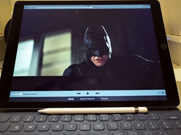
Day 5 morning, and I am close to returning the iPad Pro to T-Mobile. There are too many quirks that reaffirm my contention in this series' second post: Apple's big-ass tablet is a proof-of-concept device that's ready, or so I thought, for few users (digital content creators) but not the masses. Now I wonder if the thang is ready for anyone.
Setting up Apple Pencil should be as easy as pulling off the rear cap, inserting into Lightning port, and acknowledging Bluetooth connect request prompt. But there is no response from the tablet, after a half-dozen attempts, so I Google for solutions. No luck there, and I check Bluetooth settings, where the device doesn't appear. Disconnect my Harman Kardon speakers. No change. Turn off and on Bluetooth. Nope. Detach Pencil, try again. Success! Device shows up, pairs, then disconnects, and stays that way until I try again, and then it's "Groundhog Day" time. I'm Bill Murray reliving the same moment over and over without progress.
Resolution comes applying the tried-and-proven troubleshooting tactic: Shut down and restart. Afterwards, plugging into the Lightning port pops the permission prompt. I accept, and Pencil plows digital ink across Adobe Procreate. Something here feels too much like Windows XP during the promised plug-and-play early days. In September I complained about an overalldecline in Apple software quality over the past two years. Dare I say buggy?
No Pencil pusher this AM, other things nag. A fair number of websites appear oversized, with fonts bigger than my fingernail. They're effing huge. Some Amazon ebooks are similar, where opening them on iPad Pro enters this magnified reading realm for the nearly blind. Google+ is among the like-magnified offenders, and no setting I find remedies the need to pull way back from the screen to get something resembling reader-friendliness. Hello, developers, can we properly scale apps for the larger screen, please?
The annoyances cumulate: Feedly can't open posts in Chrome, but Safari works just fine. The key combo to bring up a current webpage search box sometimes works in Chrome, but often doesn't. The culmination of these fumbles added to so many other quirks or visual heartbreaks saps some of my enthusiasm for iPad Pro.
Physical size continues to be a dilemma. Is the tablet too big? Set up in landscape orientation with Apple Smart Keyboard attached, the size and dimensions are superior to any Mac laptop. The omission of a trackpad, while strange at first, is brilliant design. I find being closer to the screen, without all that wasted space around the trackpad, to improve typing speed, better my posture, and give greater sense of intimacy.
However, as a tablet, iPad Pro is godawful big, measuring 305.7 x 220.6 x 6.9 mm (12 x 8.68 x .27 inches). The cellular plus WiFi variant, which I own, weights 723 grams (1.59 pounds), while the non-LTE tab is 10 grams less (1.57 pounds).
Thinness, lightness, and excellent physical balance make limited one-hand carrying quite manageable. Nevertheless, I nearly dropped the tab more than once, and that's a problem I haven't encountered with any other. The thing looks too big in my hands, an impression magnified when gigantic text fills the screen. iPad Pro doesn't look or feel like a lug-around tablet. If the landscape experience is so good, then wouldn't a touchscreen MacBook be better? I can't escape that question, which nags and makes me consider returning this beast during the 14-day buyer's remorse period.
Okay, I've vented my frustrations. A follow-up post will put aside grievances and get into what I like about iPad Pro. The device does deliver many benefits and might just be laptop enough for my needs, or even yours. Maybe. It's too soon to say.
What I Don't Like About Apple iPad Pro.
![What I Don't Like About Apple iPad Pro.]() Reviewed by Queency
on
10:23:00
Rating:
Reviewed by Queency
on
10:23:00
Rating:


